 Layout
 View in Figma
Overview
Our design system utilizes a flexible and consistent grid system to ensure a cohesive and responsive design across all our products. Below are the details of our grid system for both desktop and mobile layouts.
Note that this grid system is currently only applicable for our Dashboard, but will eventually apply to our Website as well.
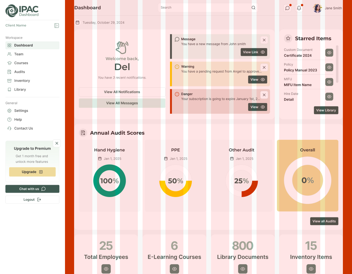
Desktop Layout
- Grid Structure (pink): 12-column grid
- Column Gap (white): 20px
- Margins (red): 40px on each side
Tablet Layout
- Grid Structure (pink): 12-column grid
- Column Gap (white): 16px
- Margins (red): 20px on each side
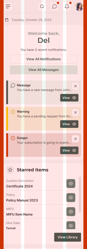
Mobile Layout
- Grid Structure (pink): 4-column grid
- Column Gap (white): 8px or 16px
- Margins (red): 16px on each side
Baseline Grid
Our design system uses a 4px baseline grid to ensure consistent spacing and sizing across all elements. This approach helps maintain visual harmony and alignment throughout the interface. All spacing (gap, padding, margin, line-height) and sizing (width, height) values are divisible by 4.
See the spacing page for more info.
Breakpoints
We use specific breakpoints to adjust our layout for different screen widths. Here are the primary breakpoints in our design system:
- Small (Mobile): Up to 767px
- Medium (Tablet): 768px to 991px
- Large (Desktop): 992px and above
At each breakpoint, the grid system adjusts to ensure content is displayed appropriately. For example, on mobile devices, we use a 4-column grid with 16px gaps and margins, while on desktops, we use a 12-column grid with 20px gaps and 40px margins.
Alignment and Spacing
Proper alignment and spacing are crucial for creating a clean and organized layout. Our 4px baseline grid ensures consistent spacing and alignment across all elements. Here are some guidelines:
- Horizontal Alignment: Align elements to the left, center, or right within the grid columns.
- Vertical Alignment: Use the baseline grid to align elements vertically, ensuring consistent spacing between components.
- Spacing: Maintain consistent spacing between elements by using multiples of 4px, such as 8px, 16px, 24px, etc.
Introduction to CSS Logical Properties
CSS logical properties and values provide a way to control layout through logical, rather than physical, directions. This means you can define styles that adapt to the writing mode of the document.
Why Include CSS Logical Properties?
- Internationalization: Logical properties make it easier to support different languages and writing modes (e.g., left-to-right, right-to-left, vertical).
- Consistency: They provide a consistent way to handle layout and spacing, regardless of the text direction.
- Future-Proofing: As web development continues to evolve, logical properties are becoming more standard and widely supported.
Common Logical Properties
- margin-inline-start / margin-inline-end: Controls the margin at the start and end of the inline axis.
- padding-block-start / padding-block-end: Controls the padding at the start and end of the block axis.
- border-inline-start / border-inline-end: Controls the border at the start and end of the inline axis.
- width / height: Logical properties like inline-size and block-size can be used instead.
Example
.element {
  margin-inline-start: var(--space-4);
  padding-block-end: var(--space-2);
  inline-size: var(--size-8);
  block-size: var(--size-6);
  }
Best Practices
Here are some best practices for using our grid system:
- Maintain Visual Hierarchy: Use the grid to create a clear visual hierarchy, guiding users through the content.
- Avoid Clutter: Ensure sufficient spacing between elements to avoid a cluttered appearance.
- Ensure Accessibility: Design with accessibility in mind, ensuring that all users can navigate and interact with the content.