 Tabs
Tabs View in Figma
Overview
Tabs are a user interface component that allows users to navigate between different sections or views within the same context. They help organize content into meaningful categories, making it easier for users to find and switch between different pieces of information without leaving the current page.
Usage
- Navigation: Use tabs to switch between different views or sections within the same page.
- Content Organization: Group related content together to improve the user experience and reduce clutter.
- Contextual Relevance: Ensure that each tab's content is relevant to the overall context of the page.
Anatomy
The tabs component consists of the following elements:
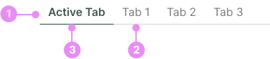
- Tab List: The container that holds all the tabs.
- Tab: The individual clickable element that switches between different views.
- Active Tab: A tab that has been clicked.
Tab States

Default State
Info: The normal appearance of a tab when it is not active or hovered.
View Code
Bitbucket Repo

Active State
Info: The appearance of a tab when it is selected and its content is being displayed.
View Code
Bitbucket RepoVariations

Mobile
Info: On mobile devices, tabs should scroll if they overflow. Use gradients on the edges to indicate more content is available.
View Code
Bitbucket RepoBest Practices
- Clear Labels: Use concise and descriptive labels for each tab to help users understand what content they will find.
- Visual Feedback: Highlight the active tab to provide visual feedback and indicate the current view.
- Consistent Layout: Maintain a consistent layout and design for tabs across the application to ensure a cohesive user experience.
- Accessibility: Ensure tabs are accessible by using appropriate ARIA roles and keyboard navigation support.
Implementation Tips
- Responsive Design: Ensure tabs are responsive and work well on different screen sizes.
- Dynamic Content: If the content within tabs is dynamically loaded, provide loading indicators to enhance the user experience.
- State Management: Maintain the state of the active tab, especially when navigating back to the page, to ensure users return to the same view.
- Mobile Overflow Handling: On mobile devices, tabs should scroll if they overflow. Use gradients on the edges to indicate more content is available.