 Tables
 View in Figma
Overview
The table component is a versatile UI element used to display structured data in a grid format. It is currently utilized in our dashboard application to present data in an organized and easily sortable manner. Tables are used to display user data, transaction records, and other tabular information. They support sorting, filtering, and various actions to enhance data interaction.
Anatomy
The table component consists of the following elements:
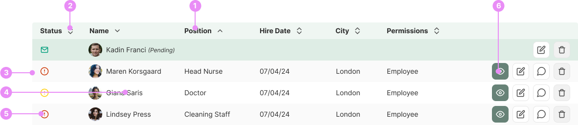
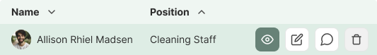
- Headers: The top row of the table containing column titles.
- Sorting: Clicking on a header toggles between ascending and descending order, indicated by up and down chevron arrows.
- Rows: Horizontal lines of data entries. Rows are zebra striped to improve readability.
- Cells: Individual data points within a row.
- Status:Some tables may show you a users status.
- Actions Buttons: Customizable depending on the component, but typically include a 'View' button to allow users to view detailed information about a specific row, an 'Edit' button to enable users to modify the data in a row, and a 'Delete' button to permit users to remove a row from the table.
Types
Standard Table
Details: A basic table with sortable columns and action buttons.
View Code
Bitbucket Repo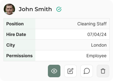
Mobile Table (Card Layout)
Details: On mobile devices, each row is displayed as a card with only the most important information and larger action buttons.
View Code
Bitbucket Repo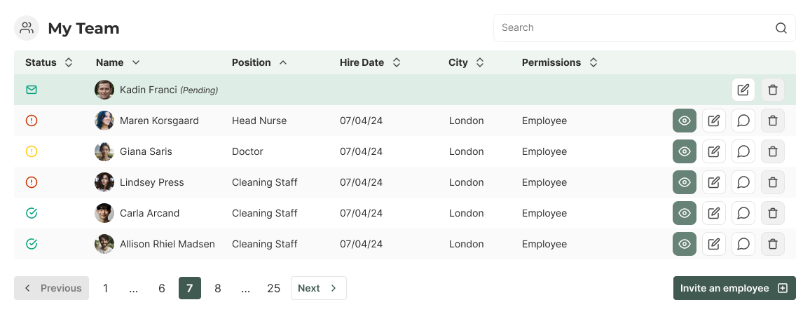
Table Card
Details: A table is typically placed inside a card component. The card always includes a heading and can optionally feature search and filtering options to narrow down the displayed data. Additionally, it may include pagination and buttons.
View Code
Bitbucket RepoStates

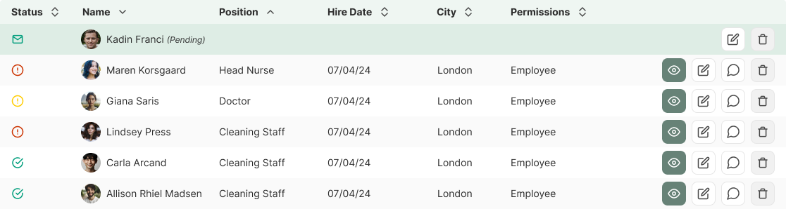
Hover/Active State
Usage: The background color of a row changes to primary-50 when hovered over, or as an active state.
View Code
Bitbucket RepoAccessibility
- Keyboard Navigation: Users can navigate through the table using keyboard arrows and interact with action buttons using the Enter key.
- Screen Reader Support: Tables are labeled with appropriate ARIA roles and attributes to ensure compatibility with screen readers.
- Touch Targets: Action buttons are larger on mobile devices to make them easier to tap.
Crimes
DO NOT
Avoid overloading tables with too much information, which can make them difficult to read.
DO
Maintain consistent placement of action buttons across all tables. They should be placed at the end of a table row.

DO
Make sure buttons are coloured based on importance. The view button should always be primary and displayed first.