 Modal
Modal View in Figma
Overview
Modals are overlay elements that appear on top of the main content to capture the user's attention and prompt them to take an important action. They are commonly used for actions such as confirming deletions, displaying lead collection forms, or providing critical alerts.
Anatomy
The modal component consists of the following elements:
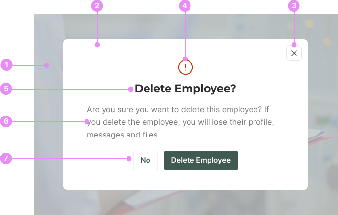
- Backdrop: A semi-transparent overlay that covers the main content, using the primary 500 color with an opacity of 25%.
- Modal Box: The main container for the modal content.
- Close Button: A button to close the modal, typically located at the top-right corner.
- Icon (Optional): An icon that appears above the heading, such as an alert icon, to provide additional context.
- Heading: A title that describes the purpose of the modal.
- Paragraph: A block of text that provides more details about the action taking place.
- Button Group (Optional): A set of buttons to confirm or deny the action.
Types
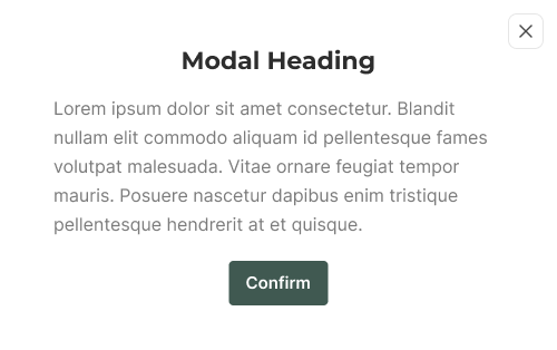
Standard Modal
Usage: Used to confirm or deny an action, typically with a heading, paragraph, and button group.
View Code
Bitbucket Repo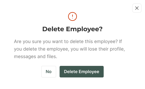
Alert Modal
Usage: Used to display critical information or warnings, often with an icon and a descriptive paragraph.
View Code
Bitbucket Repo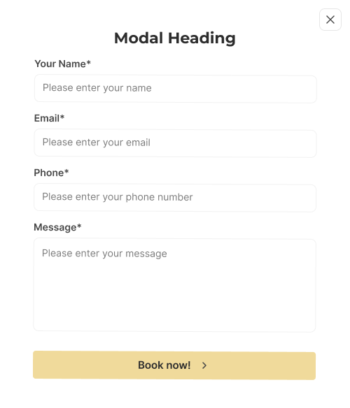
Form Modal
Usage: Used to collect user input, containing form elements such as input fields and buttons.
View Code
Bitbucket RepoPositioning
Modals are centered on the screen, overlaying the main content. The backdrop ensures that the modal stands out and captures the user's attention.
Accessibility
- Focus Management: Ensure focus is trapped within the modal while it is open and returned to the triggering element when closed.
- ARIA Attributes: Use appropriate ARIA roles and properties (e.g., role="dialog", aria-labelledby, aria-describedby) to describe the modal content for screen readers.
- Keyboard Navigation: Ensure all interactive elements within the modal are accessible via keyboard.
- Close Button: Provide a clear and accessible way to close the modal, such as a close button that can be activated via keyboard and screen readers.
Crimes
DO NOT
Don't overload modals with too much information or complex interactions.
DO NOT
Avoid using modals for non-critical information that doesn't require immediate user action.