 Forms
Forms View in Figma
Overview
Forms are essential for user interaction on both our website and dashboard products. They enable users to input data, make selections, and upload files. This documentation covers various form types, their anatomy, variations, states, accessibility considerations, and best practices.
Anatomy
Text Input / Form Group
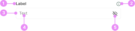
- Label: Describes the purpose of the input field.
- Tooltip (optional): Provides additional information about the label.
- Input Field: The area where users enter text.
- Placeholder/Text: Example text that appears inside the input field to guide users.
- Icon (optional): An icon that can appear at the end of the input field. ie. View Password, Calendar, Chevron.
Text Areas
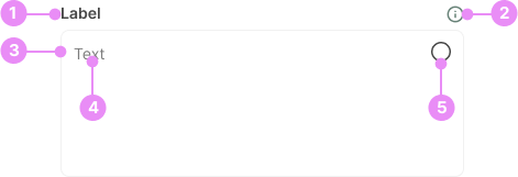
- Label: Describes the purpose of the text area.
- Tooltip (optional): Provides additional information about the label.
- Text Area Field: A larger input field for multi-line text entry.
- Placeholder/Text: Example text that appears inside the text area to guide users.
- Icon (optional): An icon that can appear at the end of the text area field. ie. View Password, Calendar, Chevron.
Radio Buttons

- Radio Button: A circular button that allows a single selection from multiple options.
- Option Label: Text describing the option associated with the radio button.
Checkboxes

- Checkbox: A square box that allows multiple selections from a list of options.
- Option Label: Text describing the option associated with the checkbox.
Toggles

- Switch: A switch that toggles between two states (on/off).
- Label: Optional text describing the toggle state.
Sliders

- Label: The label for the slider.
- Slider Track: The horizontal or vertical track along which the slider thumb moves.
- Slider Thumb: The movable part of the slider that users drag to select a value.
- Number: Displays a number depending on where the thumb is in the track.
Quantity Inputs
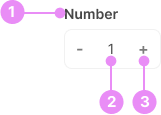
- Label: The label for the quantity input.
- Input Field: A field for entering a numerical value.
- Increment/Decrement Buttons: Buttons to increase or decrease the value in the input field.
File Upload Boxes
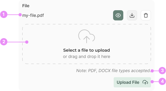
- File Selector: Located at the top, allowing users to view, download, or delete the file.
- Drag and Drop Box: An area where users can drag and drop files for upload.
- Note: Information about the accepted file types (e.g., JPG, GIF, PNG, PDF, DOCX).
- Upload File Button: A button to initiate the file upload process.
States
Form Inputs (Text Inputs, Select, Textarea)
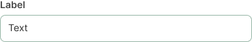
Focus
Info: The state when the input is actively selected and ready for user input.
View Code
Bitbucket Repo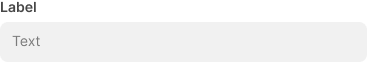
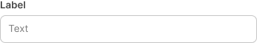
Disabled
Info: The state when the input is not interactive and cannot be used.
View Code
Bitbucket Repo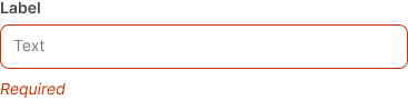
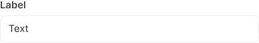
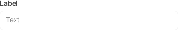
Filled and Unselected
Info: The state when the input has been filled with valid data.
View Code
Bitbucket RepoCheckboxes and Radios

Unchecked
Info: The state when the checkbox or radio button is not selected.
View Code
Bitbucket Repo
Variations
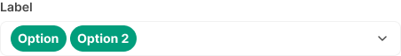
Multiselect
Info: A multiselect is a form input that lets users choose multiple options from a list at the same time.
View Code
Bitbucket Repo
Large Toggle/Switch
Info: A bigger switch with the label inside the toggle itself.
View Code
Bitbucket Repo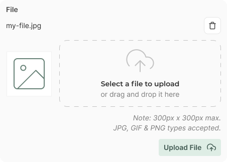

Message Field
Info: The message field is used for talking with other users or with Patty, on our Dashboard.
View Code
Bitbucket RepoSpacing
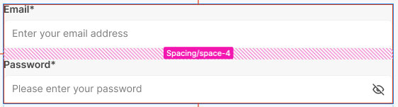
Space between form groups
Info: Ensure the space between form groups (label + input) is
space-4.
View Code
Bitbucket Repo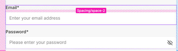
Space between label and inout
Info: Ensure the space between the label + input is
space-2.
View Code
Bitbucket Repo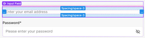
Padding inside input
Info: Ensure the padding inside of an input is
space-3.
View Code
Bitbucket RepoAccessibility
- Ensure all form elements have associated labels.
- Use ARIA roles and properties where necessary.
- Provide keyboard navigation support.
- Ensure sufficient color contrast for text and interactive elements.
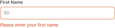
- Include error messages and instructions for screen readers.
Crimes

DO NOT
Use placeholder text as a substitute for labels.
DO
Provide clear and concise error messages.