Overview
Circle charts, also known as radial or pie charts, are used to visually represent data as a percentage of a whole. They are particularly effective for displaying progress or performance metrics on dashboards. Each circle chart includes a percentage value at its center, indicating the proportion of the chart that is filled.
Our dashboard also features line charts, but they are still a work in progress. I will update this page at a later date when they are more fleshed out.
Anatomy
The circle chart component consists of the following elements:
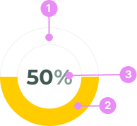
- Outer Circle: The boundary of the chart.
- Sweep Area: The colored portion of the chart that represents the percentage value.
- Percentage Label: The numeric value displayed at the center of the chart, indicating the percentage.
States
Circle charts can vary based on their state and the percentage they represent. The state of the chart correlates with the percentage value to convey different levels of urgency or completion:
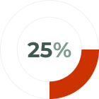
Danger (0-25%)
Info: Indicates a critical issue or failure, typically shown in red.
View Code
Bitbucket Repo
Warning (26-50%)
Info: Indicates a potential issue or a need for caution, typically shown in yellow.
View Code
Bitbucket Repo
Success (51-100%)
Info: Indicates successful completion or a positive outcome, typically shown in green.
View Code
Bitbucket RepoUsage
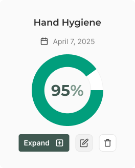
Audit Card
Info: Circle charts are typically placed inside of an 'audit' card to reflect a score, along with a heading, date and button group.
View Code
Bitbucket Repo
Audit Card Mobile
Info: A more compact version of the audit card with a small chart.
View Code
Bitbucket Repo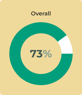
Overall Score Card
Info: A card with a large circle chart, which highlights the overall score of several audits.
View Code
Bitbucket RepoAccessibility
- Color Contrast: Ensure sufficient contrast between the sweep area and the background for readability.
Crimes
DO NOT
Don't use circle charts for complex data sets that require detailed analysis; they are best for simple, high-level metrics.